Part 4 –
Mini Brief 4 – A-Z Concepts
At the start of this session, we discussed the difference between a concept and a method, as it’s very common to misunderstand the difference or think they’re the same principle.
A concept is an idea, a mental image of what you intend to create, something that corresponds to essential features within a chosen topic of interests. Concept is based around imagination.
A method is the procedure of accomplishing or approaching something. The method process involves the tools such as design software (Ps, Ai, Id), materials, money, time scales needed to achieve the concept.
Brief four was set to challenge our mind-sets based around words and lettering, I found this brief to be of much use both in the design-based light and the research side of designing. For this brief we had to come up with a concept for each letter in the alphabet, for example, A would have a concept of ‘Acceptance’, or the letter B would have a concept surrounding ‘Beauty’. We did this task within a group of five people, having different designers all engaging together helped with the widening of knowledge and ideas, collaborating many together to come up with more exciting concept ideas as well as taking inspiration from other groups and ideas. After undergoing the group task, we were set the additional task of taking this brief further within our own way of designing and concepts. Taking away the already noted concepts, we were allowed to experiment with our own concepts and lettering, again creating the alphabet and adding in different concepts.
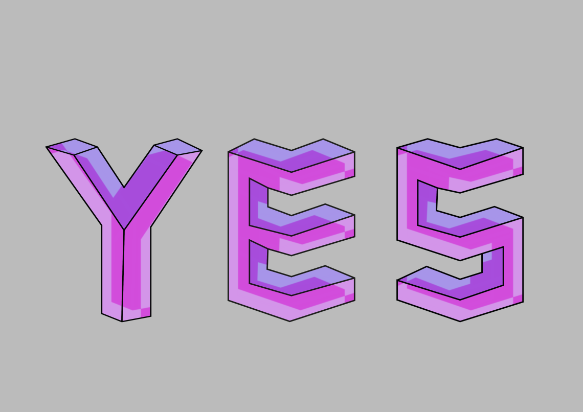
For mine I decided to try, and list concepts based around pharmaceutical products, social acceptance and the young generation, taking my third-year project further into Masters. We were told to take three letters and see what designs and ideas we could create. I designed many of my artworks on Adobe software, using Ai and Ps side by side, concentrating on typefaces (as this is a subject I find myself working well within), we were allowed to use any means of designing these letters, creating many different forms of letters, some working out better than others, with the added bonus of coming up with future ideas. I focused on the wording, how it would be arranged and structured, if each letter (word) would visually read well side by side.
Examples are as followed:
SAS – Social Acceptance Studies
YES – Young Equality Studies