FMP // LOGO // FINAL

Final Logo Design –

Moving forwards from my previous design development with my logo process, I have chosen one main logo for my brand. The name of my brand is ‘UROK’, it’s personal and gentle.

Why have I chosen to design this logo?

This logo represents my brand, a brand created in order to help individuals struggling with the pressures of medication usage.

The use of a gentle wording, sparks the imagination as to what ‘UROK’ is referring to, its free advertisement, as well as consistency.

The bubble affect, both represents the action of thought, and text, linking into the shortened version of the statement ‘you are ok’, instead being ‘UROK’.

FMP // LOGO DESIGN // DEVELOPMENT

Development to Logo –

The software I used for creating my logo was Adobe Illustrator alongside Adobe Photoshop. Illustrator was the main base for my design work throughout the whole of University, so it seemed beneficial to continue down this track.

I focused first on the lettering, trying to decide what type face would fit best for the logo, and whether or not I would need to create my own type face. Having already installed all my Adobe software, I was able to download type faces I wanted to try out and manipulate on Adobe Illustrator.

TYPE

The type face ‘ROLLER-GIRLS’ was taken forwards for further works. My reasoning behind this decision was clear, it’s a clear font, bold and easy to read. Working with just a simple circle vector, I started to mash colours together using the mesh effect on Ai, as well as incorporating lettering.

Screenshot 2019-07-15 at 19.27.40

The first part of designing something, is always about seeing what fits best, what sparks inspiration for concepts. What type of type face would I use, what colours best suited the design, and why?

I soon learnt that using the mesh tool, wasn’t going to be beneficial, and I began taking colours from the packaging images I had created and using the solid colour for the circle instead.

Screenshot 2019-07-15 at 19.54.08

Progress was slow with the design work, however, by adding another smaller circle, I was able to capture the text like shape, which linked into the text style ‘UR OK’. Tools such as the kerning tool and scaling was used for the lettering and alining of the circles, getting the correct sizes for both lettering and shapes.

The two solid colours I moved forwards with are;

  • 3fecff (blue)
  • f1c3ff (pink)

Both blue and pink are common colours used for both male and female products, both being used for both gender roles. This was the solution to the colour problem, both colours appeal to both genders, which makes logo designs quicker to construct, leaving more time for the overall project.

Further developments were carried out, such as highlighting the ‘U’ in the lettering, therefore making it more personal.


FMP // LOGO DESIGN // INITIAL IDEAS

Carrying on with my FMP work, my brand itself still needed an overall logo, as this was proving hard to design and create a concept reflecting my project aim. I had to take into consideration a name, and an image, linking back to my previous research that one without the other, if used and designed correctly can be very effective.

Three things I decided on focusing on were;

  • Minimal design
  • Limited text
  • Consistent colours

Initial ideas were carried out first through rough sketches, mashing ideas together, lettering and shapes creating different designs, sparking inspiration for further logo designs.

Both the imagery (shape) and wording were created separately, as I previously stated, it was a difficult process to come up with the logo concept. I had to keep in mind my brand logo would communicate what my brand wanted to do, keeping it simple though, as it was a brand catering to millennials, and upon research learnt millennials respond better to limited wording and more colour. It’s a psychological element to brand workings, playing to their clients needs.

Below are my initial wording ideas (brand name) –

IMG_1391

UR OK –

The name I chose to go with was ‘UR OK’, it can be read in two different ways, which I thought was beneficial, either ‘UR OK’, or ‘YOU ARE OK’, it appeals to millennials, as it’s a use of text form lettering. The name itself is simple and clean, its direct and avoids questions. It’s personal, which automatically creates a relationship between product and client.

UR OK, sounds reassuring, it’s not overly demanding like ‘RELAX’ or ‘SMILE’, instead being a familiar phrase doctors, nurses, mum and dads would say to someone who’s hurting.

Below are my initial shape ideas for the logo –

IMG_1392

Shapes were hard to come up with, especially as it wasn’t for the packaging side instead being for the logo itself. I already knew the shape I would go with would have to be big enough proportionally to incorporate the lettering. A shape was needed, as the use of colour would be added to my logo.

The logo I have decided to move further with, is the bubble shape affect. This is result to the lettering having a text like approach, which in this case, is a constant theme between lettering and logo shaping.


FMP // LOGO DESIGN // REASONING

Creating a successful logo, is one of the most important parts in communicating a brand to a potential client. While researching into top world wide brands, there was a common connection between the logo itself and the wording that followed it.

Examples such as Nike, Puma, and Twitter helped in my understanding of importance.

perspective-twitter-head-content-2017-1320x650

2010 was when Twitter decided that it needed a new logo, something that perfectly symbolised the tweets that were at the heart of the business, so they invented the twitter bird. The twitter bird summed up the objectives of the company perfectly.

580b57fcd9996e24bc43c4f3

The Nike ‘swoosh’ represents motion and speed, that and the common understanding that a tick (swoosh), is seen as a positive thing. The shape itself depicts an arc of movement. It is said, that in Greek mythology, Nike is the winged Goddess of Victory.

puma-2-logo-png-transparent

Puma, being known as a sportswear brand, has an image of a leaping puma, a panther that is active both day and night, also jumping 20 feet high. Using the symbol of a Puma, symbolises the feature of its products.


PERSONAL BRIEF // TYPE EXPERIMENTS

As my previous posts may explain, I have been able to link type, app, and layout together, creating the combined aesthetic my project visuals will now be progressing in; the beauty in the not understanding. This is a simple concept, which still links into my final major project brief specs, however, I now have a clear understanding of how my project will launch into action with having practise visual designs and type faces getting the positive responses I was aiming for.

In my post entitled; ‘PERSONAL BRIEF // PACKAGING DESIGNS’, I stated the fruit puns I would be experimenting with, taking the best ones which relate to hard times in relation to health problems.

Below are examples of type faces which may be put to use in the final production of packaging. They type face itself isn’t my own, its called Cocogoose, however, being a graphic designer it’s your job to manipulate design and create new and fresh visuals. With this, I created each quote, grouped them all together (after carefully positioning them), using the tracking tool to aline all text correctly, later using the twirl tool in Ai, at a 20 degree angle to create the ripple effect you can see below.

(Colours and scale sizes are yet to be decided, all for experimental purpose).

PRES FOR THE 2ND21

PERSONAL BRIEF // APP FACE

Looking back at past briefs, and being able to mash ideas from others into one, always gives a designers more inspiration. This being said, I have been able to gain the needed inspiration, and gather enough research into imagery, type, and app surface screen design to link them all into one.

I have carried out several experiments with each, moving forwards with the fruit pun and and imagery ideas, as well as trying to incorporate the app face design. Taking a certain idea forwards has enabled me to link ideas together to achieve higher standards of briefs I didn’t reach last time.

Below are some examples of an app face design, (which may later be used within my final project), linked into the type face brief with the use of simple comical imagery. It focusses on colour, and wording. I have designed the login page for each style, just to understand the positioning and layout functions of the app itself.

The idea of the app itself was to make the user feel more positive, hence the colours and fruit pun twist on things. The overall project idea is based around helping millennials, exploring colour and art styles has given me the opportunity to do so.

Screenshot 2019-05-01 at 14.32.54

PEACH app screen.png

PERSONAL BRIEF // PACKAGING DESIGNS

Continuing on from my last post, (card layout), I came to the conclusion and final idea, to create fruit puns in regards to mental health stigma. The imagery and text work brilliantly side by side, and draws your attention away from the negative stigma, and creates a lighthearted comical approach to bad situations with clever wording.

(PREVIOUS TWO DESIGNS)

Creating comical design work has been in use for many years, artists such as Banksy, Luke Lucas and Andy Warhol all take into account events happening around the world, and take their own personal spin on current situations through art works, whether this be the use of colour, imagery, typography or more basic art works, such a simple line drawings.

I have accumulated several fruit puns from the website; brainyquote.com, all of which upon gathering some research from my peers, have proved to be the most beneficial way to go forwards with my project wording.

The quotes include;

  • A CHERRY YEAR, A MERRY YEAR
  • SAVE THE DATE
  • PLANTED A SEED OF HOPE
  • LIFES A PEACH
  • WHEN LIFE GIVES YOU LEMONS MAKE LEMONADE
  • I FEEL BERRY TIRED
  • DON’T TAKE ME FOR POMEGRANATE
  • JUICED IN TIME
  • BANANAS IN PAJAMAS

A series of 6 surveys were filled out, all anonymously, (this helped with getting honest responses. The survey itself was very basic, with a list of quotes I would later decided on taking forwards from the data collected. Survey research showed the most popular results overall;

IMG_9255.JPG

Primary research for this stage in my project will serve as some important collective data, not only this, but it will help make my overall project less biased and more in keeping with other individuals views into mental health.

The results that I collected were not the ones I would have personally picked myself, however, as I previously stated, this helps with being none biased within my project. The two most popular fruit puns were; ‘LIFES A PEACH’, and, ‘WHEN LIFE GIVES YOU LEMONS, MAKE LEMONADE’, which helped with already having design work completed for them.

‘I FEEL BERRY TIRED’, ‘DONT TAKE ME FOR POMEGRANATE’, and, “A MERRY CHERRY A MERRY YEAR’, were the other three out of the overall nine puns that were most popular, of which, I will be moving forwards with designs for all to see if imagery and type works well for all.

An example of ‘A CHERRY YEAR A MERRY YEAR’, follows;

CHERRY YEAR

(A CHERRY YEAR A MERRY YEAR)

PERSONAL BRIEF // CARD LAYOUT

Throughout the time I have been studying on MA Graphic Design, I have had time to go back and explore past briefs set. One of the briefs which spark my interest and linked into my final major project extremely well, was the; LAYOUT brief. This brief was essentially the understanding of positioning of imagery and text within a leaflet like layout.

The brief at the start seemed easy, child’s play, but positioning subject matter in certain places to highlight separate components is difficult, hence why I set myself the additional personal brief to re-visit it, and progress further.

With the addition of other set briefs giving me further inspiration, that being, linking type and images together, I was able to visually represent common (sometimes funny) one liners, or commonly known sayings.

The lines being used do however have relevance to my project, I have tried to think about what millennials respond to, and why. Short, snappy lines, that can be linked into mental health awareness, or just the overall rubbish time, some people may be having with it, but taking Ben Frost’s non-commercial approach to the actual visuals.

I created each layout, using Adobe Illustrator, each piece is A4 size, however, if I was to take them forwards I would down size the overall design to the measurements of 99mm x 210mm, this being exactly one-third of an A4 piece of paper.

Examples are as follows;

LIFES A PEACH

(LIFES A PEACH)

This design was inspired by the commonly used phrase ‘LIFES A BITCH’, it’s a play on words and imagery, working both together, to create a comical approach. Creating line vectors simple enough on Adobe Illustrator, using the pen tool, allowing curves within the design. Colour scheme was basic, as I wanted the subject matter to be the type face, this helped by giving it a twirl effect, creating a fun, fresh approach to text.

LEMON TWIRL.jpg

(WHEN LIFE GIVES YOU LEMONS MAKE LEMONADE)

Everybody knows the phrase ‘WHEN LIFE GIVES YOU LEMONS MAKE LEMONADE’, it’s been said for many years, according to my Mum, long before I was born actually, so this design will cater to many age ranges, meaning my caution towards seeming superficial with my work, may ease off, due to familiarity. This design was again created on Adobe Illustrator, the twirl effect again being used to create a motion aspect to the flat still image.

PERSONAL BRIEF // iPhone X // APP SCREEN

App screens and story boards are of high interest to me, I feel for my project it might be beneficial to make some sort of social media platform, as my target audience is focused on millennials, and, as we all know, in the 21st century, social media is basically a form of a social norm propaganda type influencer.

As of yet, I am still undecided which logo, brand, campaign strategy to go for. I have gathered massive amounts of inspiration from past campaigns, art works, and primary research to help with this decision, but for now, I will be using experimental pieces to help scope my ideas.

Below is an example, of how an iPhone X screen would look if I was to take this approach forwards;

app hand.png

(iPhone X login screen // TTTH design)

PERSONAL BRIEF // TTTH

PERSONAL BRIEF SET – 

Leading on from my last post, I wanted to explore lettering within imagery further. Finding a word, that you can manipulate into a vector or simple image really interests me, and is used vastly in the creative arts industry.

I wanted to explore story boards further and in greater depth, really exploring how colour, texture, and lettering can come together to create what one is trying to communicate with an audience through clever visuals.

hand x1.png

(TALK TO THE HAND)

TALK TO THE HAND, is a design create to look like a hand, as well as having the visible communicated verbal aspect to it as well, as you would say working, ‘hand-in-in’, (no pun intended). Size of the lettering in comparison to the background block colour was of importance, too small, and the lettering wasn’t viable, too large, and the whiteness of the lettering was almost to bright, finding a balance is key.

Other experiments follow;

With these other follow on experiments of the TTTH designs, I kept the overall design the same, for consistency, however, I changed the stoke sizes, as well as colours being used and scale sizes of each.

With these designs, though some haven’t had the desired effect I would have liked, are all great sources of experimental pieces, that, in time, I will be able to move forwards with if needed.

pinkk.png

hand yellow

pinkkkkkk.png

hand yellow

PERSONAL BRIEF // B-OK EXPERIMENTS

PERSONAL BRIEF SET – 

Following on from the type face brief, in relation to creating depth and stories through type itself, I wanted to challenge myself to my own personal brief, this being; communicating my final major project idea through simple block text.

In third year of undergrad study within Graphic Design, I created my ‘SOCIAL ADDICT’ brand logo, (this being a geometric ‘A”), coming onto MA Graphic Design my first initial thoughts was to take this forwards, however, over careful evaluations I have decided to change my logo, as it’s a new project, and I want to achieve a different goal this time.

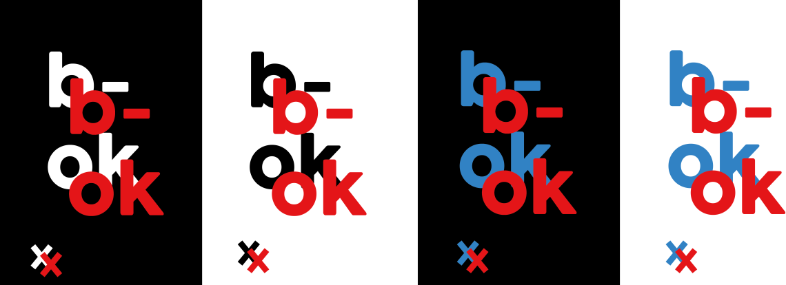
B-OK was my first strap line idea, this linked very well with my project, surrounding mental health, as well as being short enough to be produced onto packaging or campaign work.

Upon research into the symbolic value of letters and numbers, the letter ‘B’, has been said to have much value, this being; the letter ‘B’ is symbolic  of connections, wealth, and being able to spread one’s wisdom, knowledge and expertise to the masses.

b-ok.png

(FIRST ATTEMPTS AT TYPE FACE ENGAGEMENT)

The first attempts of type face engagement were made using Adobe Illustrator. Keeping all the designs on one file meant better consistency, only having to use separate art-boards to keep them all on one file.

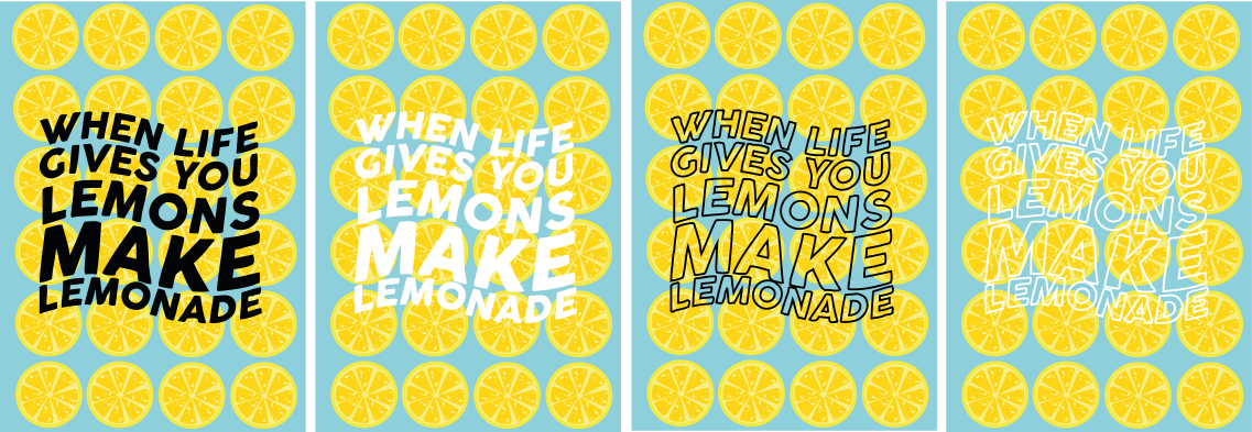
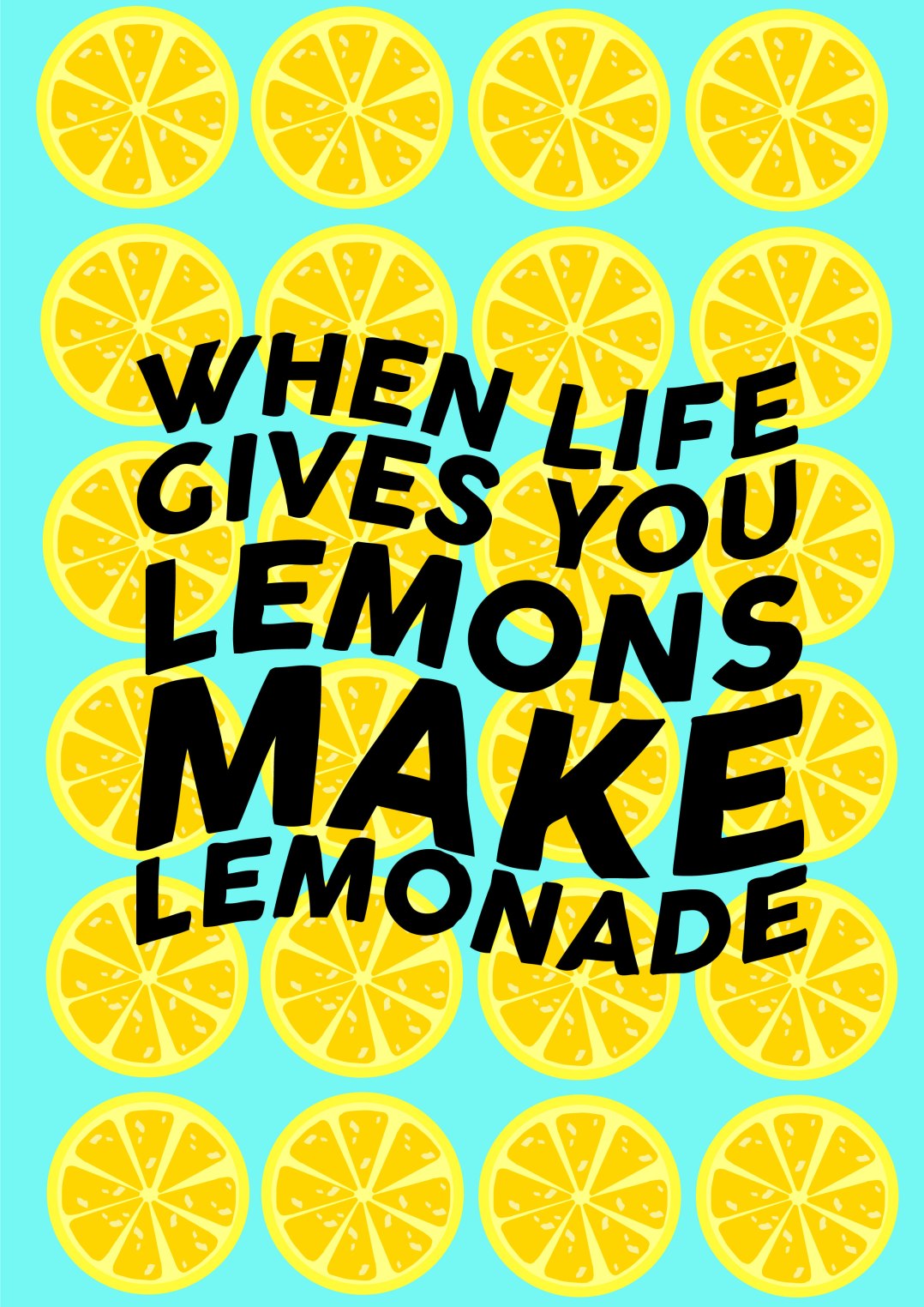
Limited colour was used, inspiration for this came from the art style ‘TYPE DRAMA’. Type drama is the art of creating type imagery, it does not conflict simple typography styles, but can be mutually comprehensive as often, less is more.

This being stated, my designs were kept very minimal, using simple block colours, and solid block shapes for the background, which meant the wording itself was the subject matter in focus.

be ok

(SECOND ATTEMPT AT TYPE FACE ENGAGEMENT)

This design was much different from the first attempts, the big difference being colour and layers. Inspiration for this design as previously stated in a previous blog post, came from the ‘Tiny Rebel’ craft beer brand.

Again this was created on Adobe Illustrator, shadow and depth was easy to create with using solid black shapes in the background, a texture affect was attempted with using different shapes with different stroke sizes and positioning around the letters.

This personal brief I set for myself really helped with understanding stories and moods throughout lettering, its a big part of Graphic Design as a whole, and my personal works within the creative arts. Using colour, texture, pattern, shape and lettering together is not only aesthetically pleasing, but opens up a designer to more ideas, collaborating one with another, opens up a gate for better inspiration.